Brian Haarmann
Solutions Engineer

If a picture says a thousand words, then with an estimated $640 billion in advertising spend for the year 2021, all of the marketing data visualizations at work in the global advertising industry must be saying a lot more than words.
Agencies and clients alike have a vested interest to make marketing performance data easier to understand, more comprehensive, centralized, and strategically reliable enough to guide decisions. That’s where data visualization can help.
In this introduction to marketing data visualization, we’ll define and discover the many different ways charts, bars, and graphs are utilized with specific audiences to elicit desired reactions, and how client reporting on NinjaCat helps agencies build dashboards and reports that look good and tell a compelling story worth investing in.
Agencies and businesses collect data every day, from web analytics, social media performance, sales by region or location, returns on investment, revenues, losses, etc. Data is meant to provide insights and ideally ease and guide the decision making process.
Data visualization showcases statistics, figures, numbers, and data through images like charts and graphs. When data is displayed visually, meaningful connections and conclusions are easier to tease out of what was formerly just numbers in a spreadsheet.
However, certain visualizations translate marketing metrics better than others.
Consider the passionate feelings revealed from a keyword search for ‘pie charts’...

The key to effective marketing data visualization is curation; not every graph and chart is required. A dashboard can look busy with dials and widgets, while failing to capture the true progress of campaigns, or measure actual business results.
If you are hoping for reliable data visualizations, the quality and provenance of your data has to be trustworthy.
Whether you choose to handle your marketing data management internally or externally, it’s important to remember the limitations that data harvesting from multiple martech platforms can impose on agencies and their reporting timelines.
Modern agencies should choose marketing reporting software that’s not only built to help save time, but provides access to the highest data quality available. What defines “data quality?”
The five traits that exemplify ‘data quality’ are:
Once your marketing performance data checks these five boxes, it’s time to choose the data visualizations that communicate the clearest picture to clients or stakeholders.
When it comes to selecting the proper marketing data visualization to include in a dashboard or report, it helps to know how certain charts and graphs can help, or hinder, a presentation.
Data visualization is effective when charts and graphs require minimal explanation and cognitive load.
This line chart exemplifies what to avoid in data visualization;
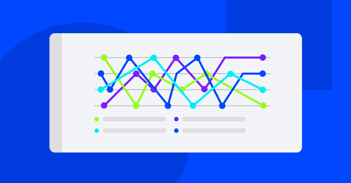
The rules to understand this chart are too complex. Overlapping lines and colors, explanatory text on the fringes; these design elements confuse and slow down the cognitive process.
The bar graph below exemplifies what to emulate in data visualization;

The rules to understand this graph are simple and easy to grasp within a few seconds. Contrasting and consistent shapes & colors, no complicated legend, and minimal text all assist in increasing comprehension and reducing cognitive load.
Of course, if you only have a few data points, it’s easy to create a simple visualization. But marketers are tasked with combing through massive datasets, which results in complicated charts that are hard to understand. When marketers take a step back from the spreadsheet and focus on the story, the complexity of choosing the proper sets of data to visualize is reduced.
If there is one main guiding principle in marketing data visualization, it’s that your visualizations should be easy enough to comprehend and digest within the first viewing.
Here is a short list of common data visualizations, their characteristics and criticisms, and how they can enhance your next performance report.

Defined: Numerical values represented by the height or length of rectangles or bars of equal width. Also called a column graph.
Pros: Shows data categories in a frequency distribution, very common in popular media, able to summarize large data sets
Cons: Causality and patterns are less clear, may require additional explanation.
Tip: Bar graphs easily expose large changes over time between different groups.

Defined: A circular graph divided into sections that represent percentages of the whole.
Pros: Shows percentages well, displays relative proportions of varying classes of data, common in popular media, size of circle can be proportional to totals.
Cons: Does not readily illustrate exact values, can be manipulated easily, many pie charts required to show changes over time.

Tip: If a pie chart is required, try to opt for a donut chart. Keep the sectors and proportions, hollow out the middle, and place the total figure in the center of the circle to aid in comprehension and cut down on cognitive load.

Defined: A graph that connects data points and lines to measure change over defined values. One of the most popular types of graphs.
Pros: Easily display data changes over time, exposes trends, both positive and negative values are included, great at highlighting subtle differences.
Cons: Easy to confuse with too many lines, better suited for complete data sets representing total figures, unable to accommodate a wide range of data.
Tip: To avoid complexity, limit your graph to five or fewer lines.

Defined: A variation on the bar graph, the bullet graph compares performance of a primary measurement against one or more data points.
Pros: Great for dashboards, can be aligned horizontally and vertically, can replace other graphs and save space on reports.
Cons: Can be confusing and distracting, goals and target areas are harder to highlight.
Tip: If a bullet graph seems too complex, reduce background colors, indicate target values, and highlight variations in colors that reduce detail and illustrate discrepancies.

Defined: A large amount of data points on a map are clustered together in a singular icon displaying key information. Also known as a bubble map.
Pros: Great for large data sets, easy to comprehend, quickly learn the sum of data points in an area.
Cons: Not useful for measurements over time, can miss small details and density.
Tip: If it helps make things more comprehensible, consider replacing numbered clusters with percentages expressed as pie charts.

Defined: A color-coded graphical representation of the volume of specific data points within a two-dimensional space.
Pros: Perfect for measuring density, provides an instant overview of web performance parameters and potential insight into UX and UI improvements.
Cons: Does not provide linear context or information on motivation, it’s difficult to map color on a continuous scale, can be hard to interpret.
Tip: Heat maps aren’t just for geographical visualization. When applied to tabular data, heat mapping easily exposes areas of interest and clusters of activity, helping you identify trends faster.

Defined: Data points in a scatter plot are indicated on an x/y-axis, but they are not joined. Used to illustrate information regarding two related variables.
Pros: Easily illustrates data correlation, indicates positive, negative relationships, shows data spread and outliers.
Cons: Too many data points can make the chart illegible, hard to label data points, difficult to establish relationships between more than two variables.
Tip: Scatter plots can be very effective if you’re interested in examining relationships at a single point in time.

Defined: A variation of a weighted scatter plot, where data points are replaced with different sized bubbles.
Pros: Can be used to determine if three variables are related without using 3-D visuals, easy to make relative comparisons.
Cons: Different sized circles can easily overlap, restricting bubble charts to limited data sets.
Tip: Bubble charts are great for visualizing SEO data like keyword rankings.

Defined: Similar to line graphs, area charts are used to illustrate how values or data points change over time. The area between the line segment and the x-axis in an area chart is shaded or colored.
Pros: Relatively easy to understand, shows scale more effectively than line charts.
Cons: Easy to draw false correlations when comparing too many overlapping shaded areas.
Tip: To better illustrate potential connections between line segments, try presenting data plots in your area chart transparently stacked on top of one another, rather than overlapped.
Knowing how to report marketing performance results to business stakeholders, whether they are internal or external, is a critical step in the quest for effective reporting.
While you may have all the data and widgets anyone could ask for, most audiences whether they’re clients, staff, or stakeholders, really only need the vital information required to help them make better decisions.
A great rule of thumb to ensure your data visualizations leave an impact on your audience is to be able to answer the question; “what is actionable from these metrics?” before you deliver the report.
Annotations that provide context and insights are often cited as the main point of differentiation between convincing or confusing reports.
And remember curation is key. Be sure your digital marketing dashboard and/or reports only highlight data visualizations that your audience can engage with and act on.
Data visualization answers the question what happened. AI agents answer what to do about it.
NinjaCat AI Agents are purpose-built for marketing teams and agencies — working directly on top of your connected data to surface insights, flag anomalies, and move from analysis to action without the manual handoff.
Here's what that looks like in practice:
The best data visualizations tell a compelling story. AI agents take that story and turn it into decisions — automatically, at scale, and before opportunities are missed.
"The agents don't replace your expertise. They multiply it." — Sandra Oono-Thomas, Head of Marketing & Digital Commerce, Daye North America
Ready to go beyond the dashboard? Explore NinjaCat AI Agents for Marketing
Whether you have dedicated marketing reporting software, or you manually create your client reports each month, most agencies already have a reporting process in place.
For most agencies, the question of how to establish sustainable and scalable processes around performance reporting, only arises when the list of client reports required, outpaces the number of deliverable reports.
Thanks to plug-and-present-performance reporting, with templates you can automate and annotate at scale, you can take marketing data visualizations to the next level with NinjaCat.

The NinjaCat Report Template Builder includes common marketing data visualizations like tables, bar, line, and mixed charts, scatter plots, pie charts, and cluster maps.
In addition to data visualization, reports can easily include images and text so you can incorporate insights and context throughout.
Along with our fleet of AI Agents, and hundreds of pre-made data visualization widgets, NinjaCat integrates with over 150 marketing data partners, which means you can trust the data flowing into your dashboards and reports.
With NinjaCat, you can produce beautifully-designed, automatically generated marketing performance reports at scale.
.png)

.png)