
Jake Sanders
Content Strategist

When it comes to marketing reporting dashboards, there's a game of ‘telephone’ every organization plays without meaning to. Stop us when this sounds familiar.
Raw performance data gets collected, cleaned, and compiled into a report. The report gets summarized for leadership. The summary gets refined into a deck. The deck gets presented to people who will make decisions based on it, decisions about budget, strategy, headcount, and direction.
By the time the data in a marketing reporting dashboard reaches the room where it matters most, that data has traveled through four or five layers of editorial judgment, each one adding a little coherence and subtracting a little mess.
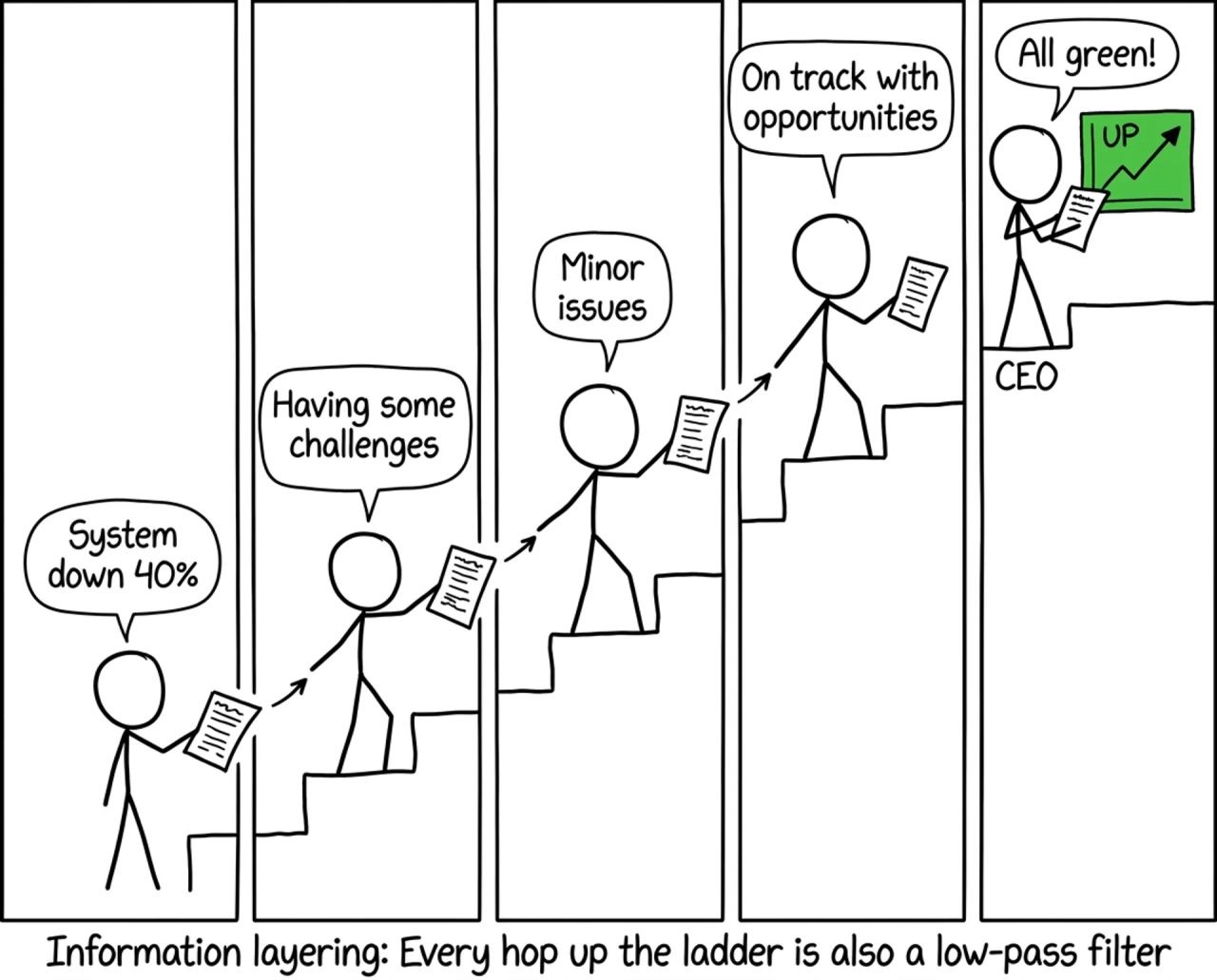
The results in the dashboard look authoritative, which is exactly the problem.
Business strategist and organizational psychologist Irina Wolpert has studied this pattern in her work spanning across financial services, fintech, enterprise software, and AI. In an article written for Harvard Business Review, Wolpert calls it “the two-organizations” problem.
Wopert explains in the piece that there's the reported organization, and the lived organization. The reported org exists in dashboards, board materials, and town halls. Inside what Wolpert refers to as “the lived organization,” employees experience what they would on an ordinary Tuesday.
According to Wolpert, three structural forces drive the gap between the two different orgs: information layering, where each reporting tier smooths away complexity on the way up; incentive shaping, where people present what they believe will be rewarded; and tenure curation, where by year five the CEO is governing the version of the company the company has learned to show them.
AI is accelerating all three. The board deck is now drafted by an assistant. The version that reaches leadership is more streamlined than ever, but does it have actual substance?
“The presentation that arrives for the CEO is more coherent and more authoritative than any prior version,” explains Wolpert. “Whether it is more accurate is a question almost no one is asking.”
Most conversations about trust and marketing reporting dashboards, focus on the presentation layer — the chart, the benchmark, the framing. But the distortion usually starts much earlier, before anyone makes a single editorial choice.
When the underlying data is fragmented, manually reconciled, or inconsistently defined across platforms, the version that reaches the analyst is already compromised — before a single editorial choice gets made. The problem isn't intent. It's structurally broken inputs. By the time that work has traveled two more layers up, nobody can trace where the inconsistency entered the chain.
In an older NinjaCat case study, Emilio Rodriguez, Senior Digital Account Manager at Hometown Media Services, put it more bluntly: "Reports weren't consistent,” said Emilio, “and we were stuck taking screenshots and putting them into PowerPoint slides."
His team was managing 10 to 20 clients each, pulling data manually from Facebook, Google, Spotify, radio, and billboards — and every consolidated view was an assembly job, not a direct readout. The picture their clients saw was only as accurate as the last person who had copied it across.
That distinction matters more than it sounds. A reconstruction is shaped by the choices of whoever built it. A readout is traceable back to the source. Most marketing reporting dashboards are reconstructions presented as readouts, and the people relying on them often can't tell the difference.
Consider a scenario that plays out at agencies every month. A paid search analyst notices a conversion rate has dropped 18% week-over-week. They investigate, find a broken tracking pixel on the landing page. Conversions are still happening — they're just not being recorded. They log the issue, flag it internally, initiate a fix.
But the weekly report has already run. Because spend and impressions look normal, no dashboard flags an anomaly. Two layers up, a media director sees "stable delivery." Two layers above that, a CMO sees "slight softening — within normal variance." The pixel was broken for eleven days. Nobody lied. The data was technically accurate at every level it was reported. And yet the business was flying blind for nearly two weeks because the signal degraded on the way up.
This isn't unusual. It's a reasonably typical Tuesday, that “lived organization" experience Wolpert mentioned in her article.
Two NinjaCat clients illustrate what it looks like when the telephone chain gets cut short.
Sandra Oono-Thomas, Head of Marketing & Digital Commerce at Daye North America — a U.S. subsidiary managing outdoor power equipment brands across retail and eCommerce channels — described the before-state plainly: "We were always behind, never ahead." Data lived in disconnected places across brands, channels, and geographies. A complete cross-channel view required a week of manual compilation and was outdated by the time it landed. The team was perpetually reacting to a version of their own performance that had already passed.
After deploying AI agents through NinjaCat, Daye North America reduced manual data analysis by 80% and identified $1.5M+ in measurable sales impact through improved inventory forecasting. The shift wasn't just faster reporting. It was temporal — the business moved from lagging to leading, from seeing what happened to anticipating what would happen next.
VML, a global marketing agency managing performance and commerce data across some of the world's largest brands, ran into the same ceiling. Summary-level dashboards couldn't keep pace with the volume or the complexity. Their solution was Commerce Funnel Felicity, an AI agent built on NinjaCat that monitors 20 million sessions weekly — cross-referencing behavioral data with customer feedback to surface issues no consolidated report would ever flag, including conversion problems in specific geographic markets that hadn't appeared on anyone's radar. As Erick McNett, Managing Director of Marketing Effectiveness & Analytics, put it: "One of the biggest advantages of an agent is that it sees things we didn't anticipate."
That's the exact opposite of the telephone problem. Instead of delivering a polished version of expected performance, an agent built for ground truth finds the unexpected — the anomaly, the broken pixel, the regional outlier — before it has the chance to be smoothed away by the chain of summaries above it.
The telephone problem won't be solved by technology alone. Michael Skapinker, writing in the Financial Times, cited research by Harvard's Joe Bower to make the case for what actually breaks the pattern: the deliberate, personal deep dive.
Bower tells the story how famed leader, Jack Welch, heard GE's CT scanner tubes were failing ahead of schedule. Welch didn't wait for a report — he went and looked. The tubes failed at 25,000 scans, less than half a competitor's benchmark. He put his weight behind the fix, and tube life reached 200,000. No dashboard was going to hand him that.
The discipline is simple and difficult: one problem, chosen on purpose, taken to the bottom by the person who can actually fix it. Tighter marketing data models paired with stronger data infrastructure earns the right to be curious, but it doesn't replace curiosity.
What it can do is change the starting conditions. When data is unified, validated, and monitored continuously — when anomaly detection flags a broken pixel on day one instead of day eleven — the summary chain has less room to degrade. The distance between ground truth and the marketing reporting dashboard shrinks. The telephone game doesn't disappear, but the message that travels through it has fewer places to get lost.
The prettier the dashboard, the less you should trust it. Pick the one number nobody wants you to see. Then go see it.